
Make your project sound amazing!
From upbeat and energetic to calm and soothing, Chris tailors his delivery to suit your specific needs. Whether you need a voice for commercials, explainer videos, narration, voicemail greetings, or anything in between, Chris is here to help.
Take a listen
Commercial
Narration/Explainer
Audiobook
Recent projects
Audiobooks
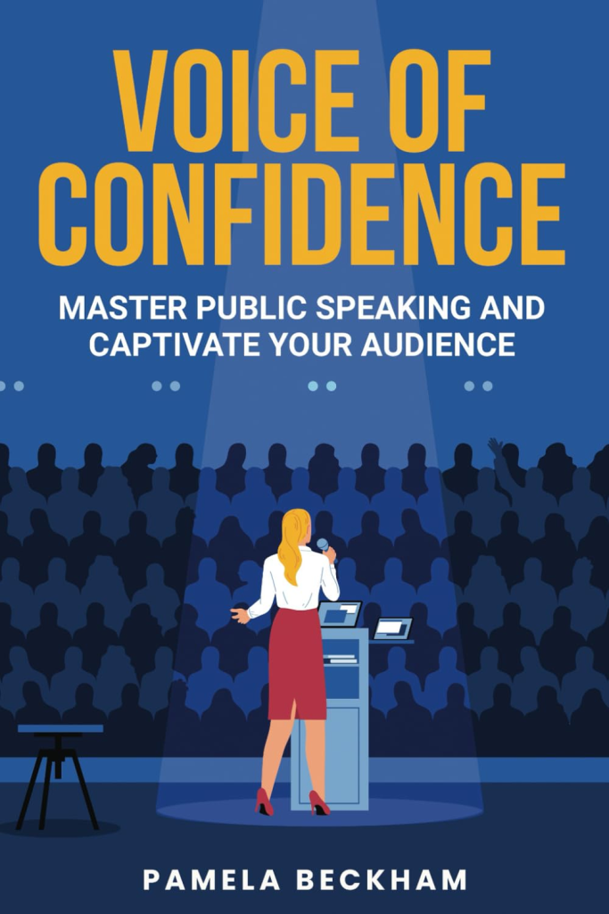
“I really enjoyed the book. It was valuable to hear all the different techniques to be a better public speaker. The reading/delivery was smooth, clear and confident.”
– Andrew K. via Audible
“…this is also a Zen-like experience of exploring nature in a calming and soothing style. It’s great just to put on and listen to so you can experience nature.”
– Ian K. via Audible
Commercial Voiceover
What a fun project! Chris had the privilege to provide his voice for a series of social media spots for Nordstrom’s Anniversary Sale. The marketing campaign had a grocery-store theme and he played the role of overhead announcer. How great is that?!
Video Narration
Chris partnered with the Chamber of Commerce in his hometown of Mt. Pleasant, MI to provide voiceover for several videos presenting awards to local individuals and businesses. Chris was super honored and proud to support this small and thriving community.
Request a sample
Request a sample from Chris to hear how he can help with your next project. He’ll provide you a broadcast-quality recording within 24 hours. Providing a few specifics will help to ensure you get the perfect read for your project:
- Tone, style, and pacing
- Approximate word count
- Where it will be used and for how long
- Target budget
- Timeline
Chris works within the GVAA rate guidelines.
About Chris

Chris is a Seattle-based voice artist known for bringing projects to life with a dynamic and engaging voice. Chris works in markets of all sizes, but having grown up in the rural Midwest, Chris loves collaborating with producers in smaller, tight-knit communities where his voice can have an outsized impact.
Hailing from the beautiful Pacific Northwest, Chris enjoys unwinding with friends over a glass of wine or a well-crafted cocktail, diving into some science fiction, exploring the great outdoors, and satisfying a love for travel.
The technical stuff:
- Microphone: Rode NT1
- Interface: Focusrite Solo
- Hardware: MacBook Pro
- Software: Adobe Audition
- Network: 1 gigabit wired-connection
- Communication: Source-Connect, Zoom, Google Meet, Teams, Skype
- File Sharing: Dropbox, Google Drive