Category: Research
-
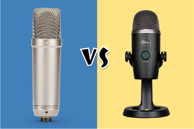
Your microphone captures every nuance of your voice, bringing characters to life, and ensuring you’re producing a professional and polished product for your clients. So, which is right for you?
-

The quest for a high-quality microphone often comes with the misconception that you need to spend a fortune to achieve professional results. I’m here to debunk that myth.
-

Whether you’re drawn to the allure of bringing characters to life, narrating compelling stories, or voicing commercials, the journey begins with some essential steps.
-

Understanding the landscape of voice acting, its demands, and its viability as a career can save you time, money, and potential disappointment.