Invoice Management 2.0 – Conceptual Designs
Overview
While the visual-only refresh was continuing, I led design efforts to determine if a more significant update made sense. As with all software––within in time––it starts its inevitable path toward obsolescence.
The Challenge
Migrating the application to a newer, more stable technology platform (in this case, .NET) was a conversation that began within engineering. Eventually, it included me working with the product manager to consider the merits of updating the user experience. Based on the visual refresh, I felt there were areas that were good candidates for improvement:
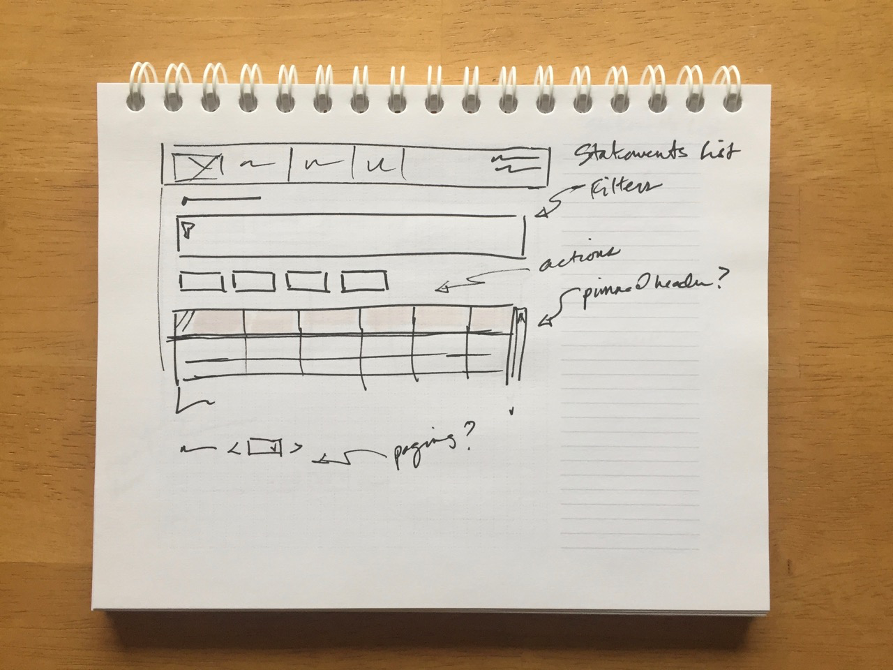
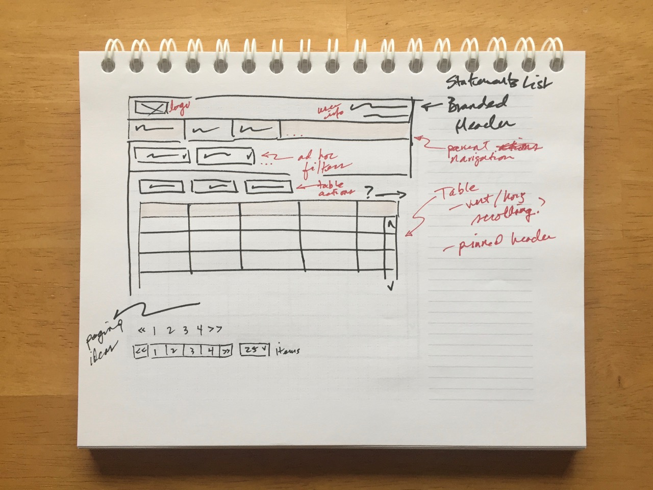
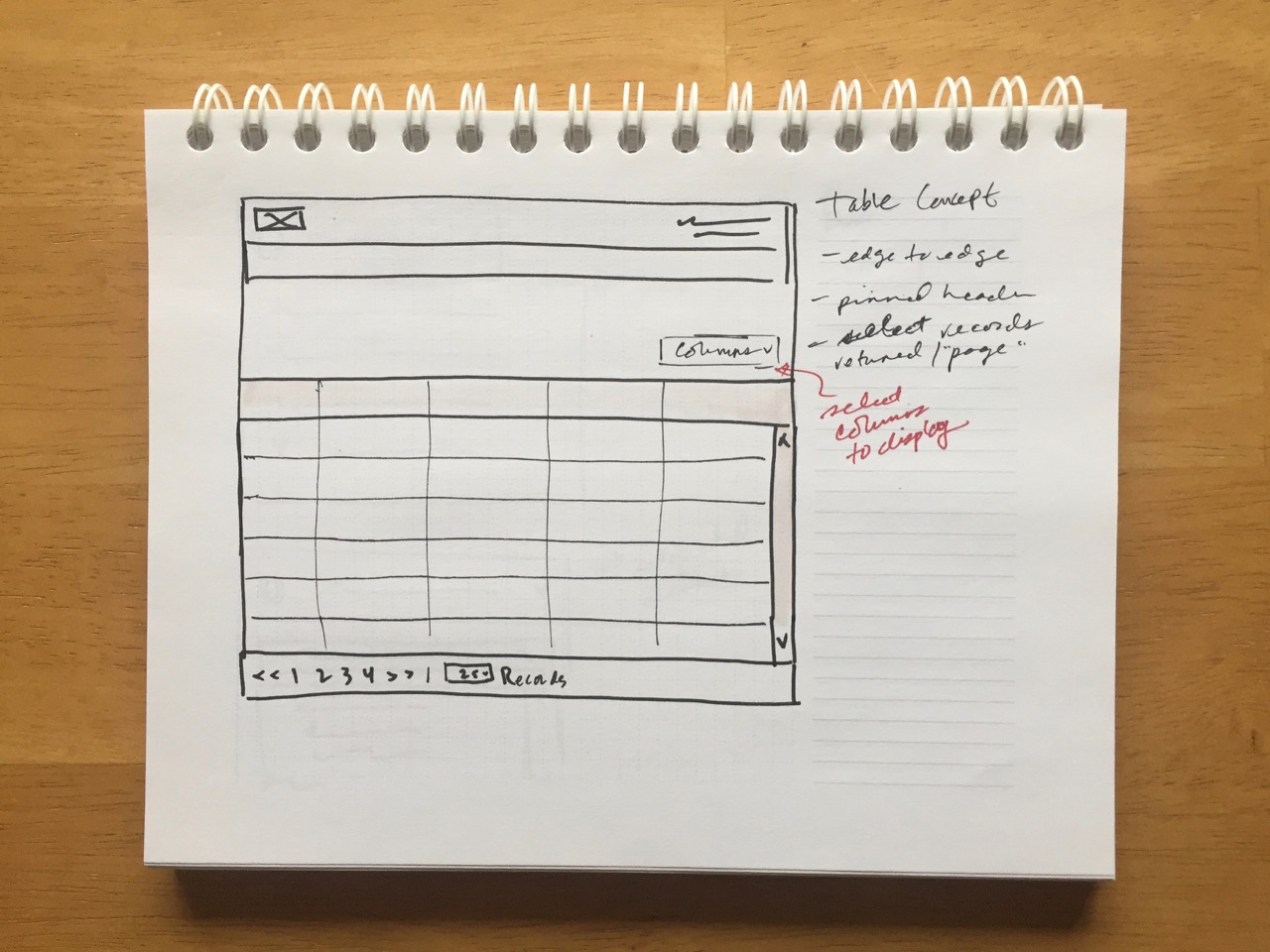
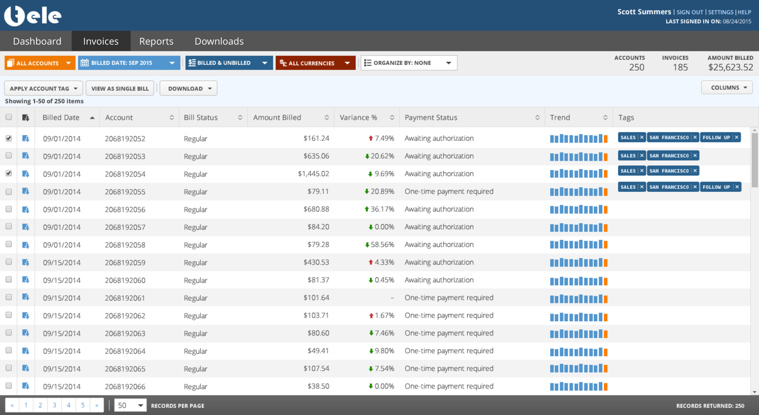
- Invoices list display
- Single invoice display
- Filter controls
- Reports consolidation and display
- Streamlining interactions
Understanding the Users
I used my findings from the visual update to inform my research here.
Primary users remained the same- Accounts Payable Manager: Oversees a team of clerks and supervisors responsible for all accounts payable functions. They are tasked with monitoring the daily operations and making sure spending adheres to budget.
- Accounts Payable Clerk: Responsible for completing payments and controlling expenses by receiving, processing, verifying, and reconciling invoices.
- Accounts Payable – Invoice Validation: For large companies processing thousands of invoices per month, there is a dedicated role or team solely responsible for the validation between purchase orders (PO) and supplier invoices.
Design Thinking
This was my opportunity to bring a fresh perspective to an aging application and go beyond just a visual refresh. I selected functionality in the application that I felt would allow me to help scope my work and allow me to present my ideas to the team and leadership effectively.
Baseline Concepts- Display size
- Gone are the days of 4:3 aspect ratios displaying at 1024px widths. With the application being so data-heavy and full of tables, one of the first things I wanted to explore was using the entire width of the user's display.
- Font size
- One of the things that always bothered me about the old app was just how small everything was. In the visual update, I increased the font size because there was no reason to limit it (i.e. better displays and more real estate). I continued this idea into the redesign utilizing responsiveness inherent in Bootstrap––the technology I used to help inform my design thinking.
- Streamlining interactions
- Some interactions in the application take the user away from their current workflow which is never a good idea. I proposed ideas how the application can do a better job of keeping the user focused on the task at hand.
- Invoices
- Invoices list and single invoice display including invoice comparison
- Filtering
- Controls that dynamically refine display of data
- Reports
- Consolidation and reorganization of reports and report display
Design Concepts
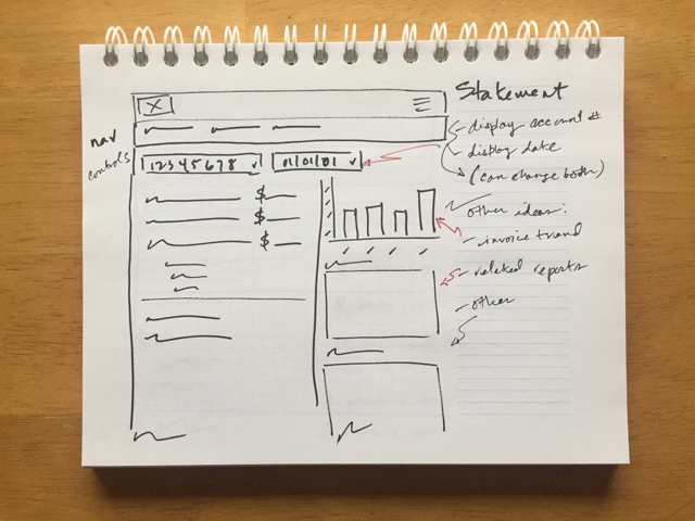
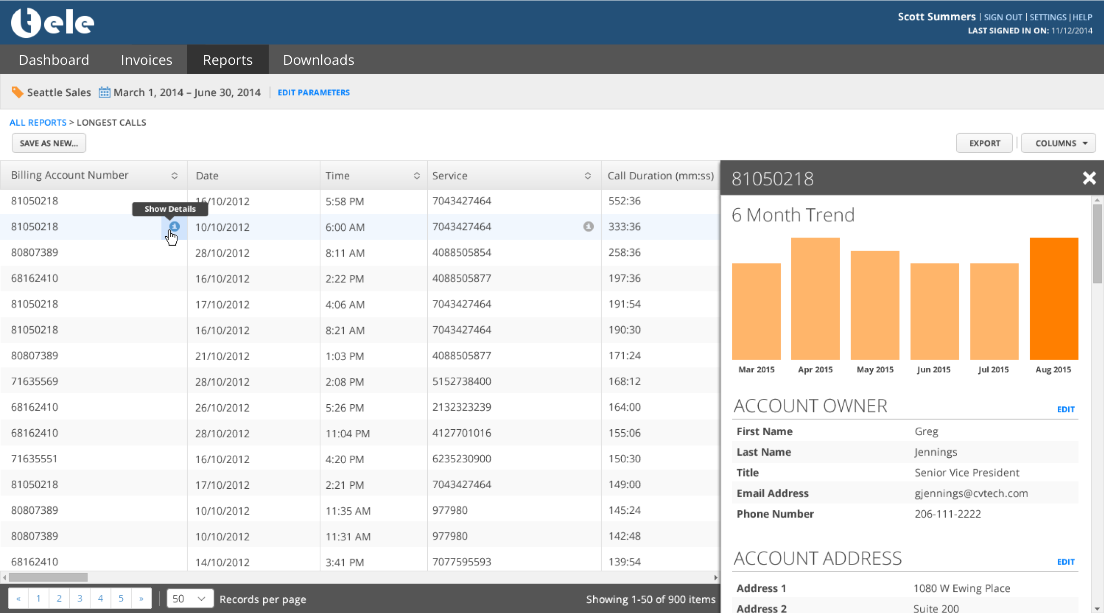
Invoices List Display
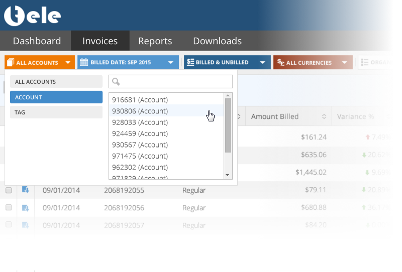
As with the visual refresh, I wanted to take advantage of a typical user’s display width which was often greater than 1280px. I also integrated in other ideas such as "tagging" and toggling the display of columns dynamically. The updated filter controls concept is seen just below the main navigation.
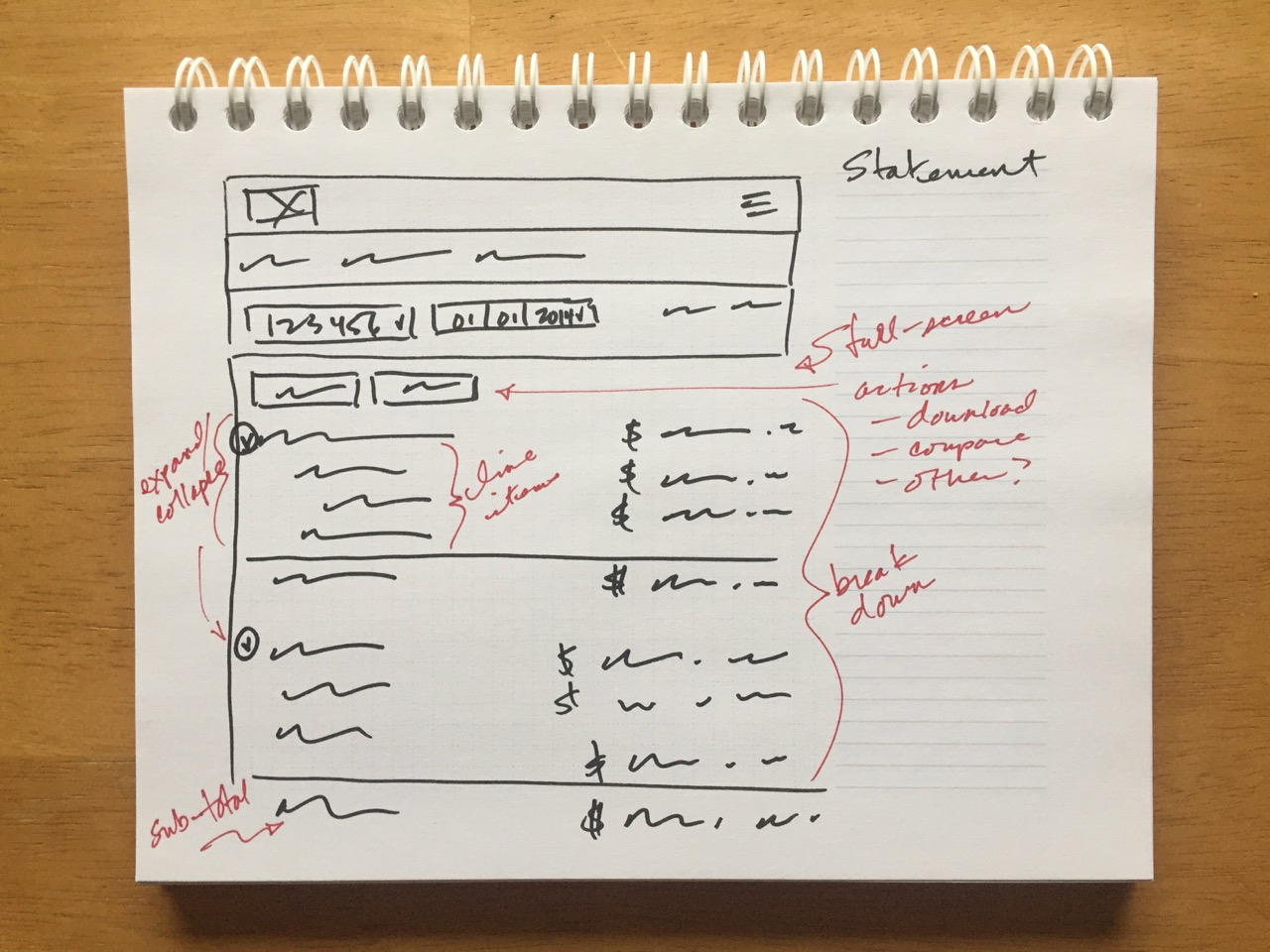
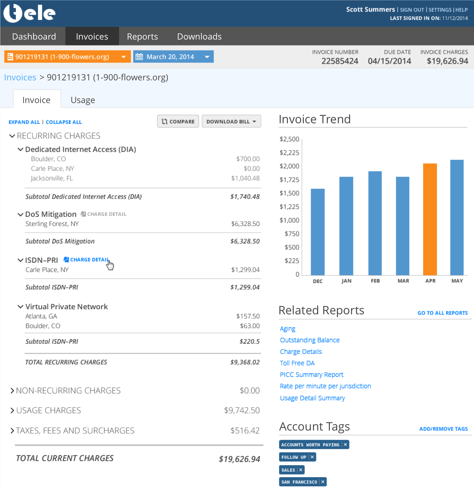
Displaying an invoice was helpful but boring. This concept integrates in other interesting features like invoice trend, tagging, and related reports. In an effort to keep the user from having to navigate away, I broke up the invoice data across tabs into a summary overview and detailed usage which is typically only accessible as a report.
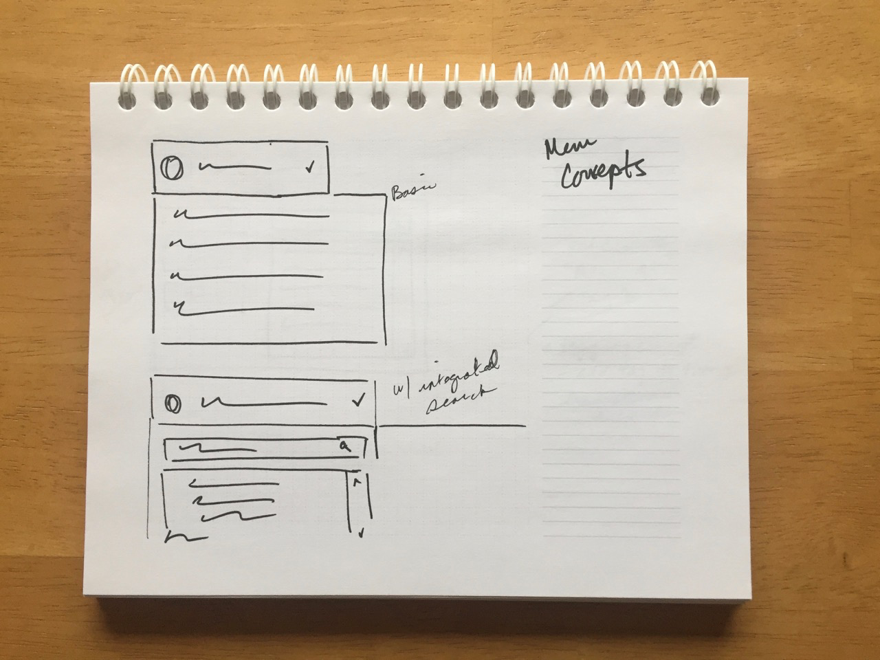
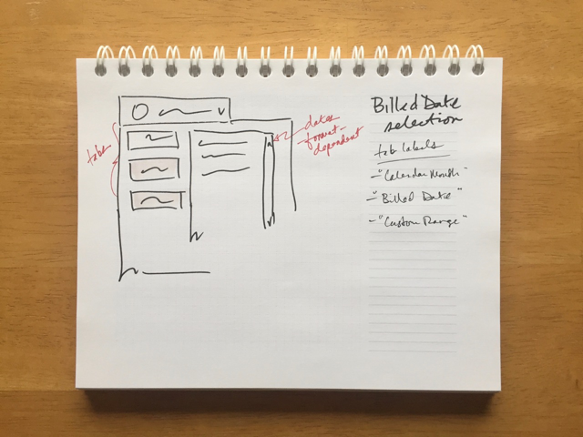
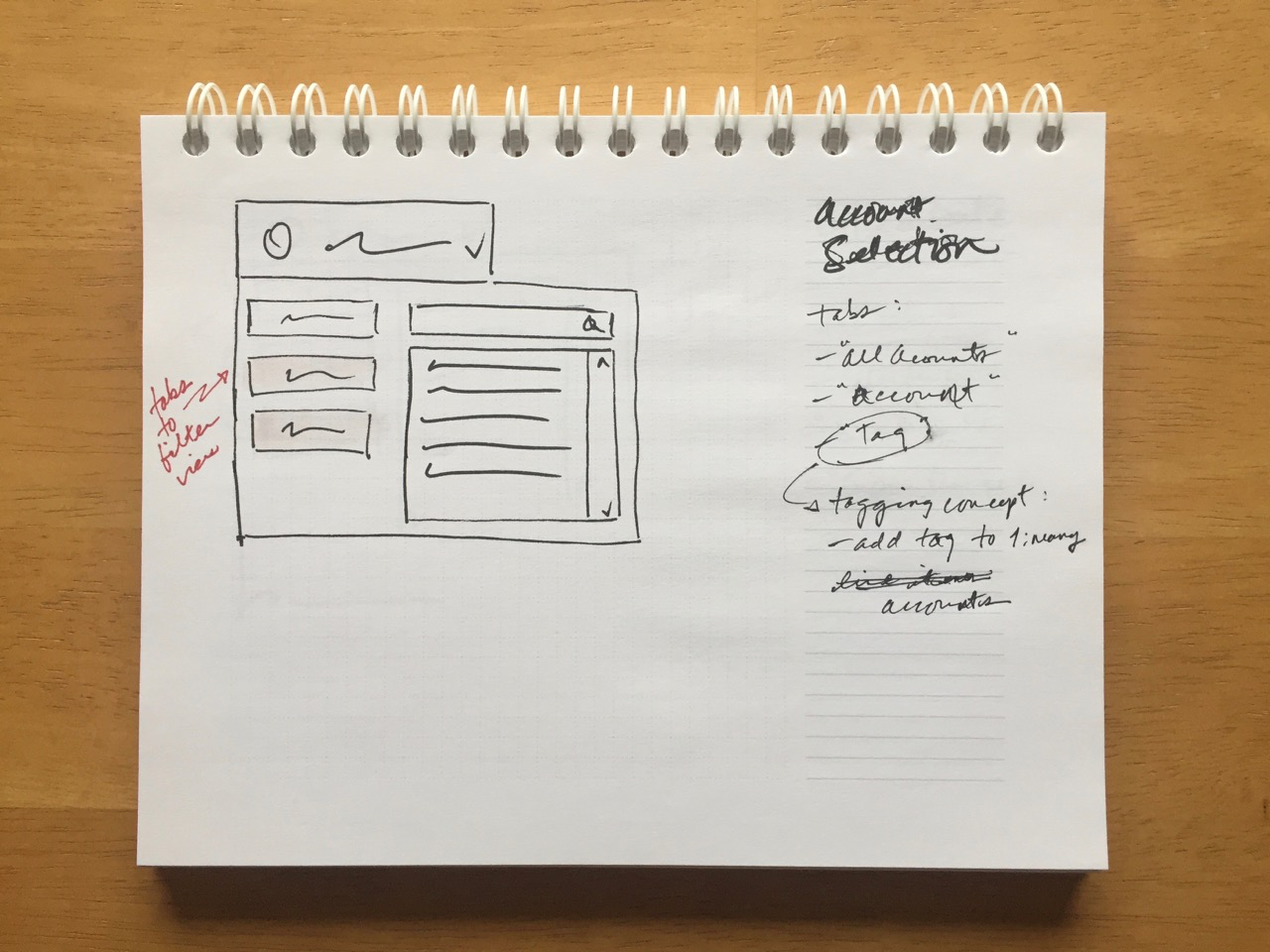
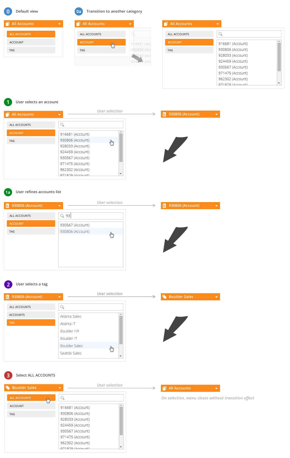
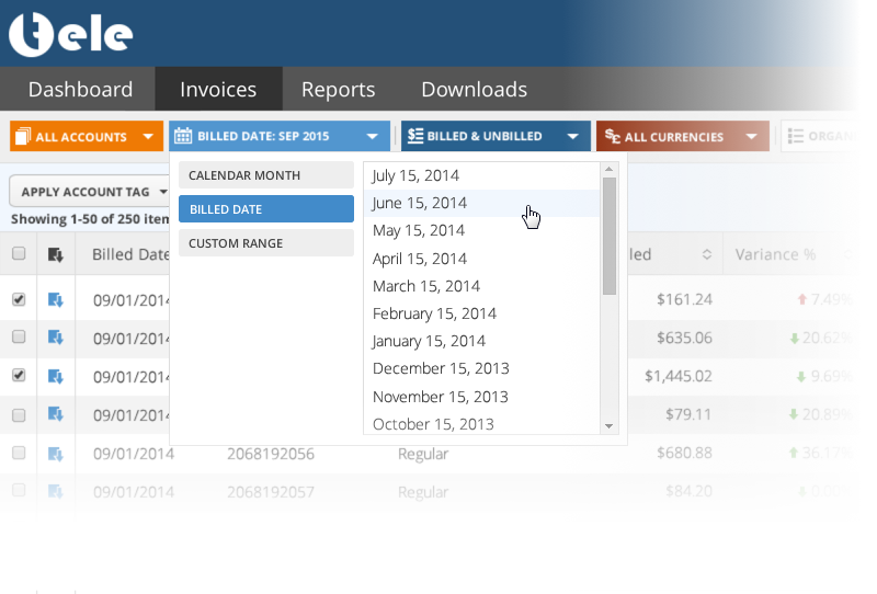
Filtering Control
Like all filtering controls, the idea is to limit what a user sees based on the inclusion or exclusion of properties related to that data. These controls did that, but it also set the active "parent" view. As a user, I want to select a specific accounting group within my organization so that I can manage only its call usage.
A typical scenario would be that an accountant manager wants to see only the activity of a certain account which in some organizations might contain many devices. From here, it gets significantly more nerdy. In the old interface changing the context of what you were looking at meant navigating someplace else in the app to change it, then navigate back to where you were with no help from the system.
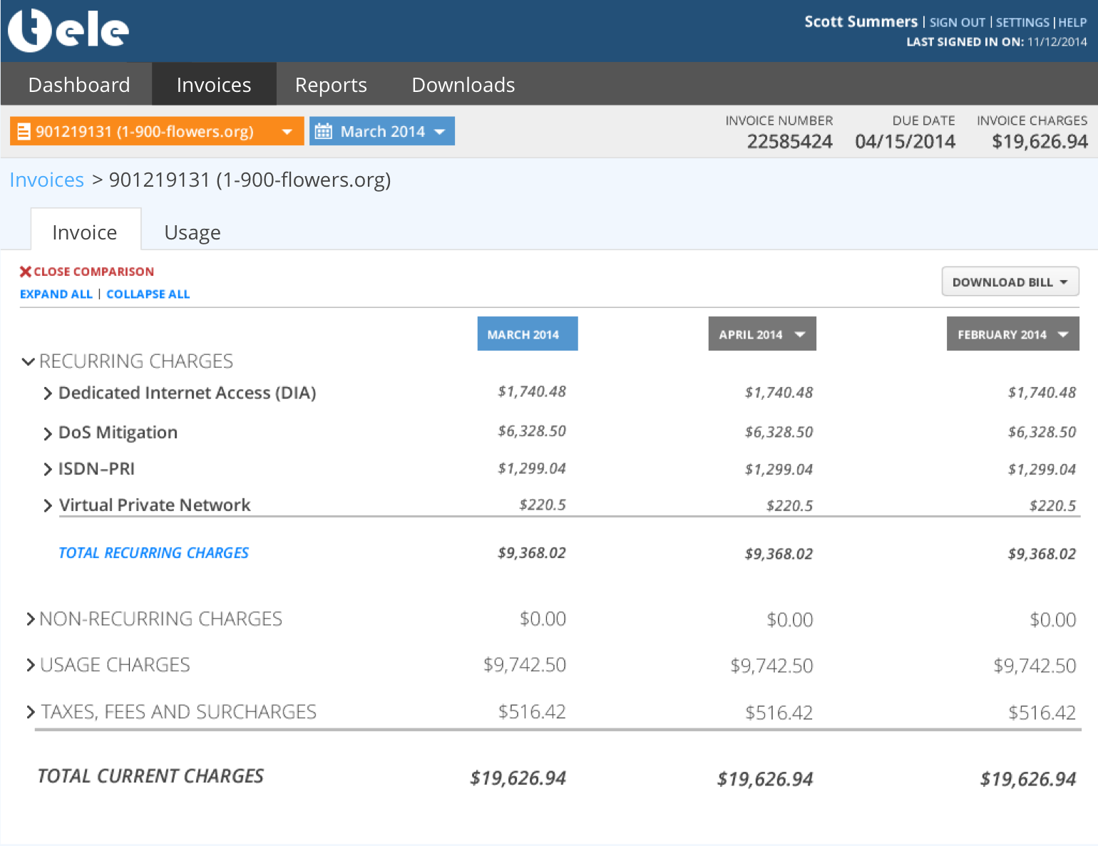
Invoice Comparison
I simplified the base functionality of comparing different invoices to one another. In my concept, a user could compare up to three, but they could change the invoice date dynamically. There was nothing to suggest a user wanted to compare more than three; typically it was two. Changing the date right above the invoice data allowed me to greatly simplify the interaction.
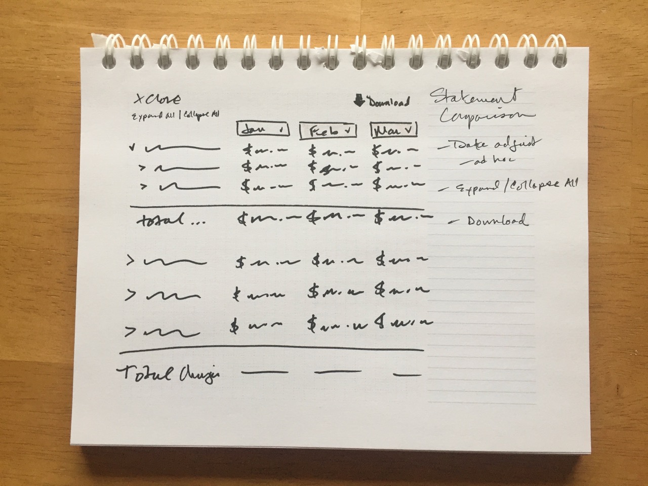
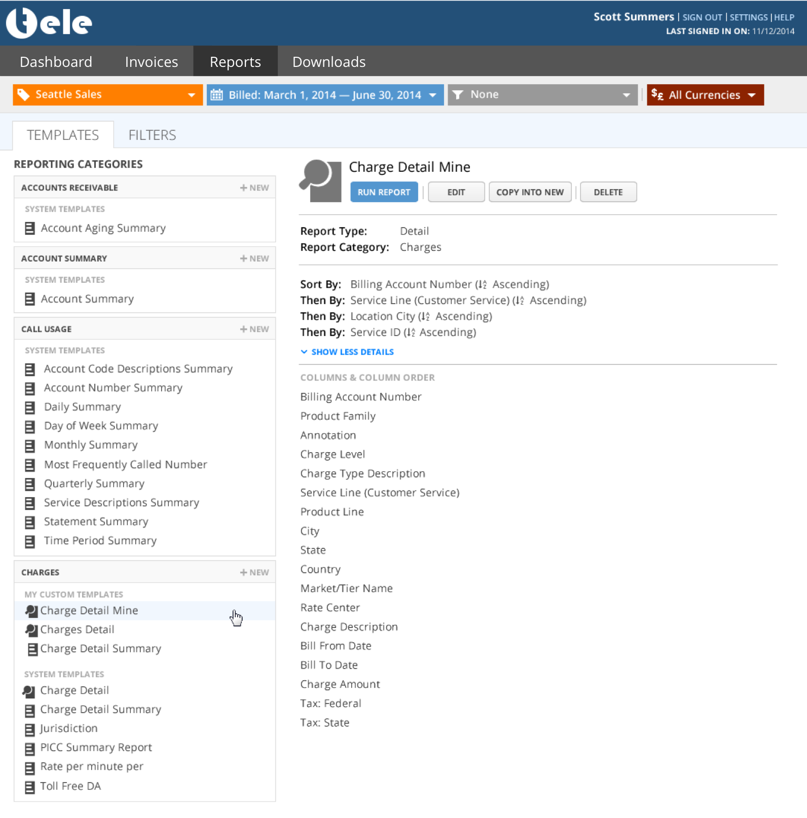
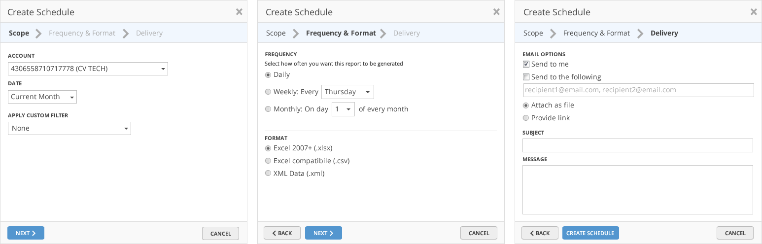
Reports
These concepts explore the idea of consolidating all reports together in the same place. The older model gave each report type its own dedicated view. My goal was to create a centralized reports management experience that would help to streamline creating, scheduling, and running reports.
Conclusion
Due to resource constraints and alignment with the company's goals at the time, the technical and therefore the visual upgrade was put on hold. From a purely ROI perspective, this probably made sense. Longer term, it will be necessary that the application at least receive a technical update. My assumption is that at that time they will also embark on a visual update as well. I feel confident that my work here will help to inspire the next generation of this product.