Waxvine Product Branding
Overview & Challenge
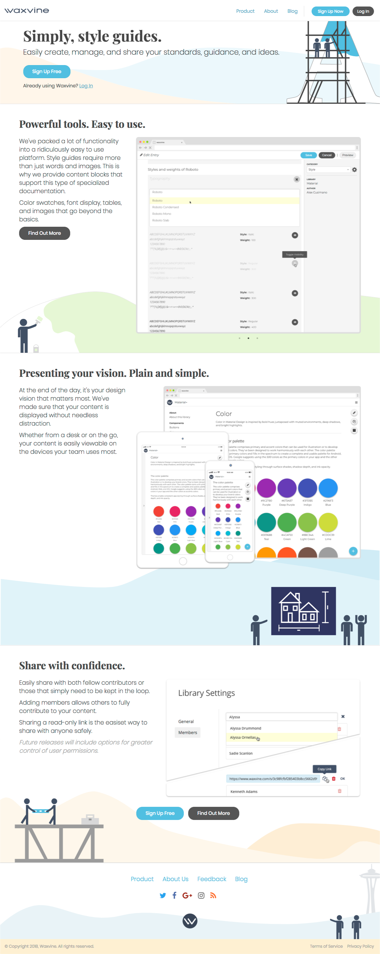
One of the most challenging aspects of building a startup is marketing. When we originally launched, the website was very simple. Too simple, really. It didn't say enough about what we offered, our message was too vague, and it had no personality.
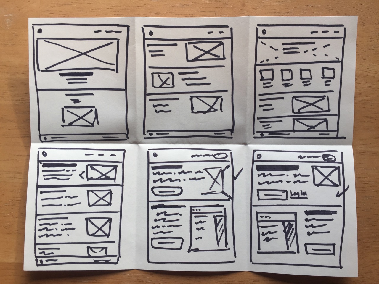
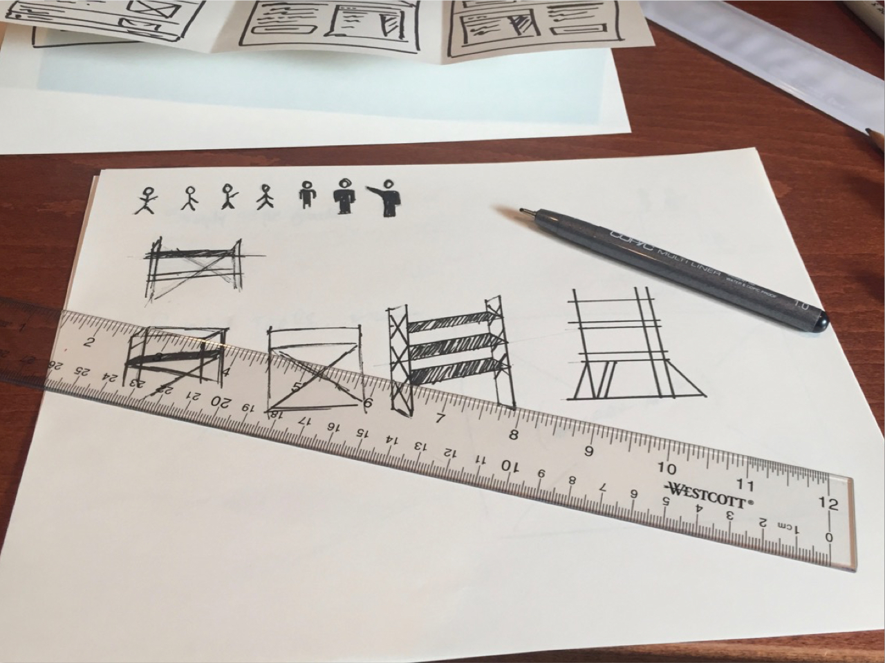
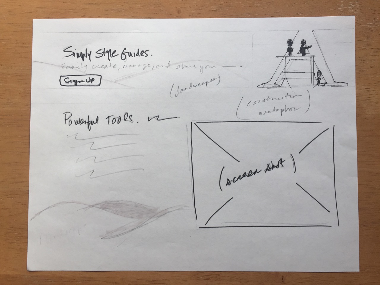
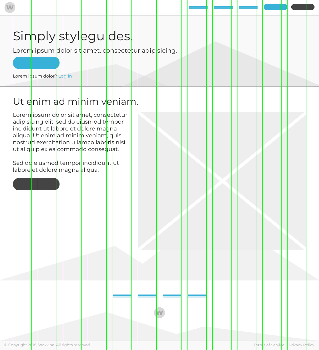
Initial Sketches & Concepts
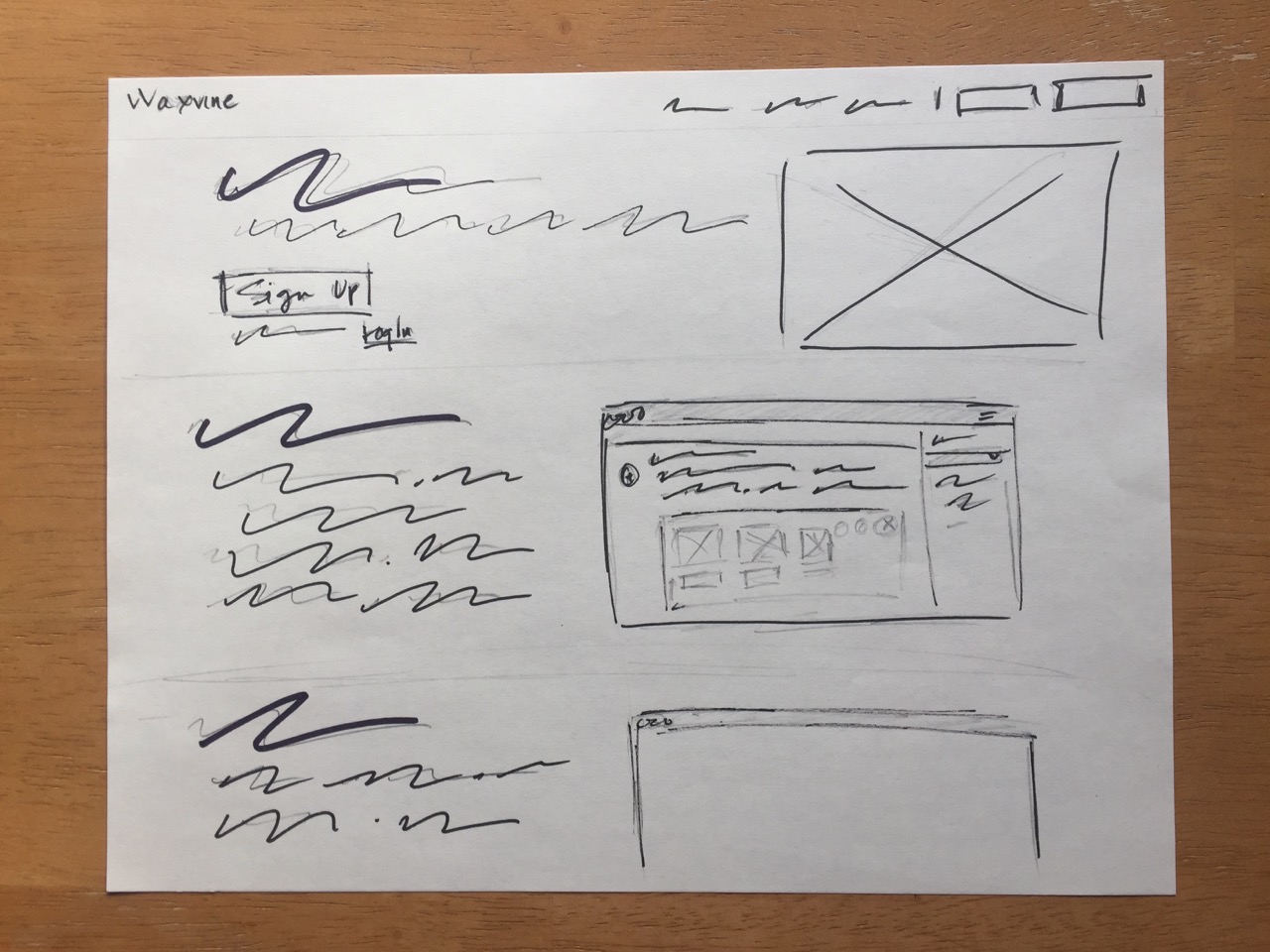
Final Design
A construction metaphor would serve to bridge a potentional gap in our messaging: who we are and what is our product. I also wanted imagery that was easy to create and maintain as I fleshed out our marketing content.
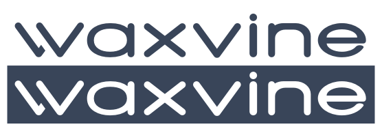
Name & Logo Design
I wanted a name that was made up of real words, was easy to pronounce, and was memorable. Waxvine represents the effort that goes into distilling large amounts of information into something that is easily consumed.
I had similar goals for the logo: something recognizable, and timeless. With the use of negative space, the avatar represents both the "W" and the "V" and is a powerful representative of our brand.