Design Standards
Overview
I owned the research, development, and maintenance of platform design standards during my time at The Gates Foundation. Its purpose was to detail the components, patterns, and standard interactions that supported the development of the foundation's investment management system.
Opportunity
The foundation's investment management platform––which includes multiple standalone apps––contains a mix of out-of-the-box and custom solutions. While Salesforce's Lightning Design System provides a list of its components and some guidance on patterns of use, it does not indicate how the foundation implemented those components or provide any info on its custom-built solutions. There was no other reference to use to help ensure consistency in the experience.
Research & Ideation
UI Audit
Research began with an audit of the application to identify the various components that were being used, making note of which were out-of-the-box and which were custom.
Stakeholder Interviews
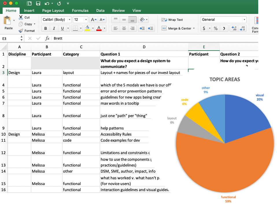
I continued with interviews that included engineers, QA, business analysts, fellow designers, and product managers. The goal was to gather everyone's perspective on the expectations that a set of published design standards would provide them and their team.
- What do you expect a design system to communicate?
- How do you expect your team would use a design system?
- Who do you expect will own the design system?
- Who do you expect will be the primary author of the system's content?
- What are some words you would use to describe your experience with design systems?
From these interviews, I gained a clearer understanding of the breadth and depth of the content that should be published. From the responses, I created topic areas which gave me an idea of the type of content that might be most valuable.
Publishing the Content
What to include
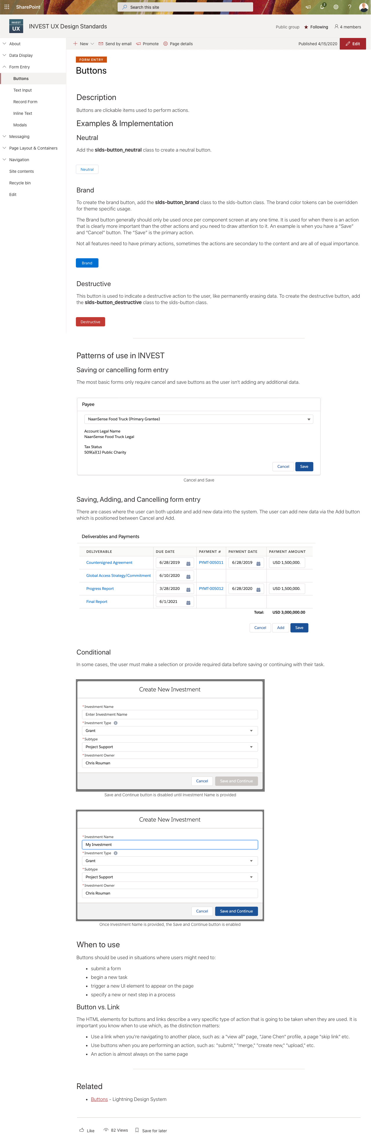
The goal of these standards was to provide guidance where it didn't exist elsewhere (i.e. Salesforce's lightning design system). It needed to describe both custom-made components (data grid) and to specify how out-of-the-box components (those from Salesforce) were being used. For example, only certain button styles are used.
- Is the component used in several places?
- Is the component also custom?
- Is the component also out-of-the-box but only a sub-set of styles are used?
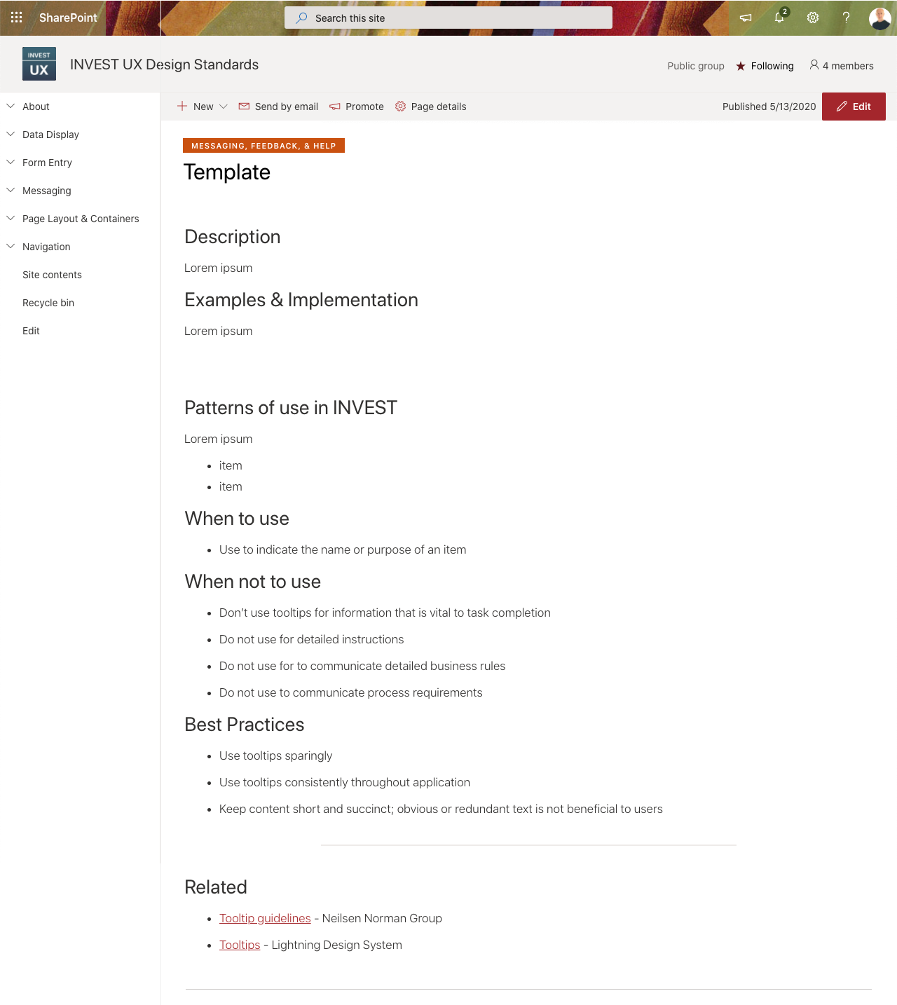
Page Structure
Each entry follows a basic template that provides a description, and details about its expected implementation, behavior, and guidance on its proper use––with plenty of images.
Custom Component
Custom components are made to serve specific needs that an out-of-the-box Salesforce component can not address and are visually indicated as such near the top of the page.
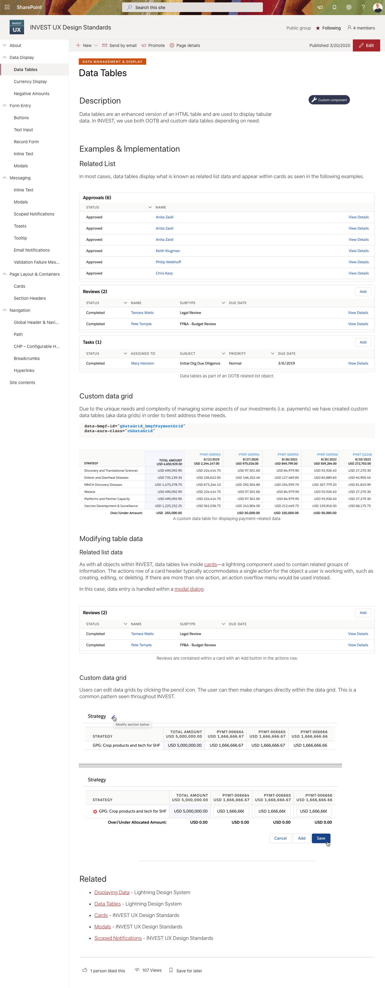
Salesforce Components
A Salesforce component is meant to be used as-is; the advantage being that implementation is sped up considerably. In cases where only a sub-set of that component's styles were being used (e.g. buttons) or further guidance might be useful (e.g. text input), these instances are also documented.
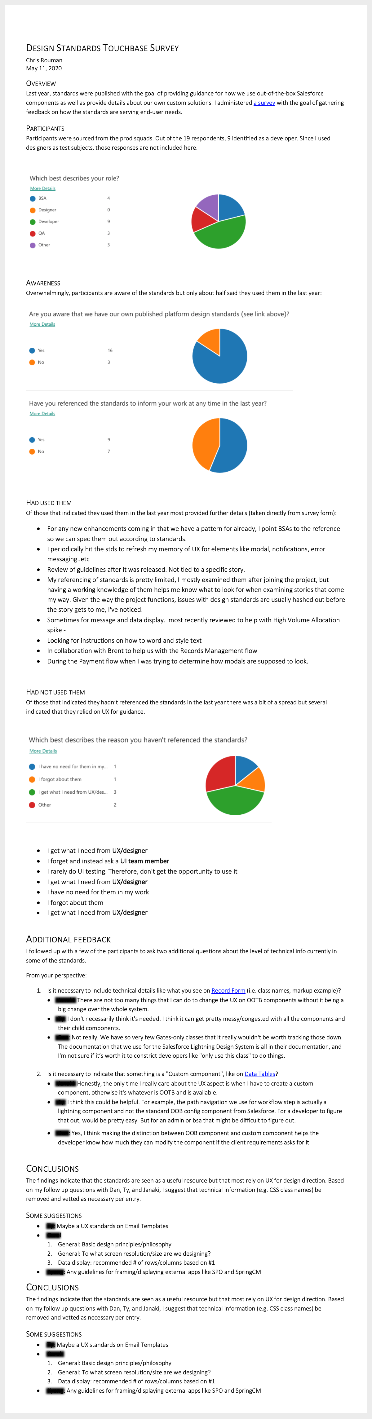
Follow Up Survey
To ensure that the standards were continuing to serve our project team's needs, I conducted a survey about a year after their initial publication. Analysis suggested some minor tweaks but otherwise the standards were providing the value that I was expecting.